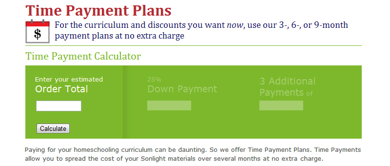
He squinted over his glasses at the screen. 'Why is that text repeated?' he asked himself. 'Can't we say that just once instead of three times?' Dave, our graphic designer, was hard at work cleaning up the Payment Plans page to make it easier to understand. He simplified a ton of the text and made the Time Payment Calculator prettier. I'm pleased with the results:
The effort required to simplify something is enormous. Often it's clear what the problem is, but the solution is out of reach. Consider your tax forms. It's pretty clear that they are confusing and messy. But I can't imagine the amount of work that would go into cleaning them up. Even if you do come up with a solution, the simplification isn't always easier understand. Have you seen the push button, receive bacon signs? How about the incredibly vague images highlighted on safenow.org?
The goal of simplifying is to make the tool easier to use and understand. And that was exactly what we attempted to do with the Instructor's Guides this year. Have you checked out the changes?
Instructor's Guide Improvements
If you have yet to order your homeschool curriculum (with the updated IGs), spread the cost of your investment over the next three months at no additional charge with Payment Plans. And please continue to send us feedback as you browse the website. I'd love to simplify it even more so it's easier to use and understand.
~Luke Holzmann
Filmmaker, Writer, Empty Nester
P.S. Speaking of easy and understandable, have you shown some MathTacular clips to your children?


